Development of the iPhone skin
March 16, 2016
During the process of developing a Scream Moschino iPhone skin, I started by creating application icon designs that would fit the Scream Moschino aesthetic using Adobe Photoshop.
The first ones I created were circle, this was due to the fact that I had decided to use a paint effect for the background so that they did not look too clean cut as that would not fit with the overall theme. A colour palette of blues, pinks, purples and greens was used to tie in with the rest of the work. The patterns used were ones that would appeal to our target audience.
Once the icons were all made, I changed the shape to the generic iPhone icon square, in order to make them look uniformed.


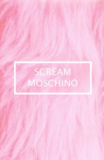
I then went on to create the home screen wallpaper. As a of this project was inspired by Scream Queens, I chose to use pink fur as the background as fur is used a lot in the show. I then proceeded to add phrases such as, 'fashion kills', 'fight like a girl' and of course 'scream moschino'. These phrases were chosen to evoke a sense of 'girl power' while still being teen orientated.
Finally lock screen was then created. To keep a sense of uniform, I once again used the pink fur background. As teens as notorious for being possessive over their phones I covered the lock screen in the words 'DON'T TOUCH' over and over and included a don't touch symbol.
Developing the iPhone skin was a challenging but enjoyable experience. A lot of aspects had to be considered when creating the skin therefore proving challenging. The size and resolution of the app icons, home wallpaper and lock wallpaper needed to be considered to ensure that the skin would be compatible with an iPhone despite having to resize images numerous times, I had to ensure that the quality of the image was not compromised. I also needed to make sure that the overall aesthetic of the skin complimented the rest if the campaign therefore any colours or patterns I used needed to be similar to what had already been used in other parts of the campaign. Another challenge I faced was learning how to transfer the finished product to my phone with working icons, I was able to do this using a website that links the icons you create to the corresponding apps this creating a fully functioning iPhone skin. Overall I believe that I created a successful iPhone skin that compliments the other outcomes, I also found that I was able to develop my Photoshop skill further during this process.


0 comments